See how to create your own charts from data in Caflou:
🙏 The feature is in beta version and despite its great potential, it is possible that it will have flaws and limitations. If you encounter a flaw or bug, please let us know via the in-app chat.
💡 Tip 1: Aggregated data
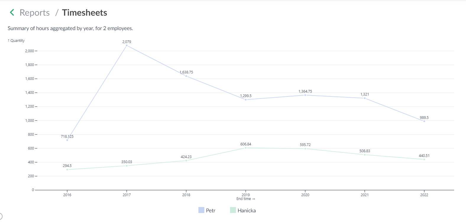
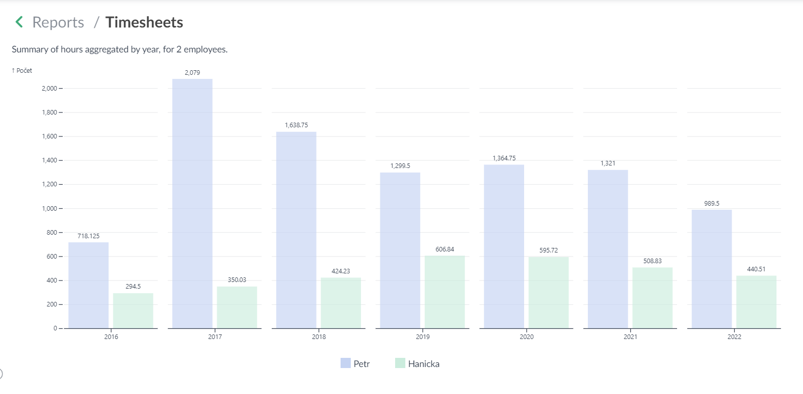
Any chart where you use a date attribute on the X-axis (e.g. payment or due date, date of timesheet or tracked time, task or project start or end date, etc.) can now be aggregated as follows:
- by year
- by month
- by weeks
- by days
- by day of the week (e.g. for reports where you can see which days of the week are the most/least worked)
If you select an attribute for the X-axis that is a date, then you get a new option in the report definition form to select a value for "Aggregation of dimension X"
💡 Tip 2: Cumulation of aggregated data
If you use aggregated reports (see Tip 1), you have the option to cumulate the values in the chart (option "Cumulate dimension X"). That is, the value for the previous period is added to the value for the following period (e.g. when aggregating by years, the year 2022 contains the values for 2022 and also for all previous years, if such data exists for the report).
💡 Tip 3: Data sorting by value
If you want to sort the information on the X-axis according to its value (e.g. amounts or counts from the highest value to the lowest), then use the "Sort" option where you can choose:
- Automatic (the system will use the default sorting logic for the X-axis dimensions, e.g. alphabetically, by date, etc.)
- In ascending order of dimension Y values (the system will sort the chart from the left from the lowest value to the highest)
- In descending order of dimension Y values (the system sorts the graph from the left from the highest value to the lowest)
💡 Tip 4: Comparing multiple sources/datasets in bar and linear graphs
If you want to compare multiple sources of data in one chart, e.g. employee performance, salespeople comparison, or compare expenses from different categories, etc., you can "Add dataset" in the report settings. This will allow you to add another filter to the chart settings that will just determine the next set of data. Multiple such sets can be added to the chart.
In a bar chart, each data set then has its own color-coded columns. In a linear chart, each set then has a color-coded line. The graphs then also have a legend identifying the color of each data set.
💡 Tip 5: Display/combine two separate graphs in one
In one combined chart, you can compare two separate graph that can separately display, for example, different objects (e.g. companies and projects) or different units on the Y-axis (e.g. numbers and profit).
You can create such a composite graph via the "Add Combined Report" action, which allows you to display two charts "over each other".
Two charts can be combined with the following logic:
- The first report must be of linear or bar type only
- Only the follwoing types can be combined (the system will not offer other combinations))
- linear/linear
- linear/bar
- bar/linear
- ☝ The attribute on the X-axis/dimension of both graphs must be the same or the attribute must be of the "date" type
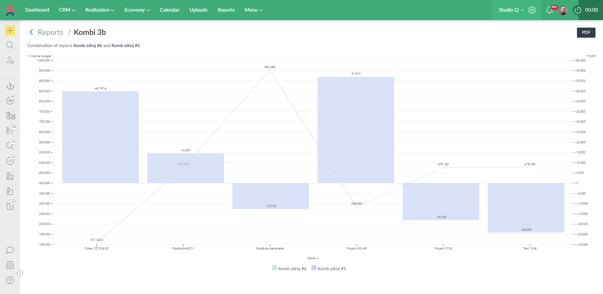
(graph combining the report of project budgets and project profits)
💡 Tip 6: You can use custom attributes for both X and Y axis in the graphs
Learn more about custom attributes here: How to work with custom attributes 📖